Scripps College Press
Beorum II: Fragmentary Evidence
Beorum II: Fragmentary Evidence is an artist’s version of a leaf of the Gutenberg Bible, which is currently housed at Scripps College Denison Library. The piece includes 84 lines set using type from the font-set of 246 different characters used by Johann Gutenberg in the first major book printed with moveable type. Cast by Dale Guild Typefoundry in Howell, New Jersey, it is the first modern reproduction of Gutenberg’s important achievement.
The binding reflects the printing known as “the black art with red linen spine,” and the book is housed in a Plexiglas case. The students involved in the project wrote and set their own stories based on the idea of “risk,” reflecting the risks Gutenberg took in the making of his work.
Artist: Collaborative Work
Press: Scripps College Press
Date: 2004
Number and Edition: 31 of 93
Size: 6” x 16”
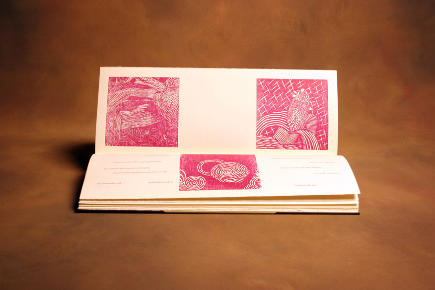
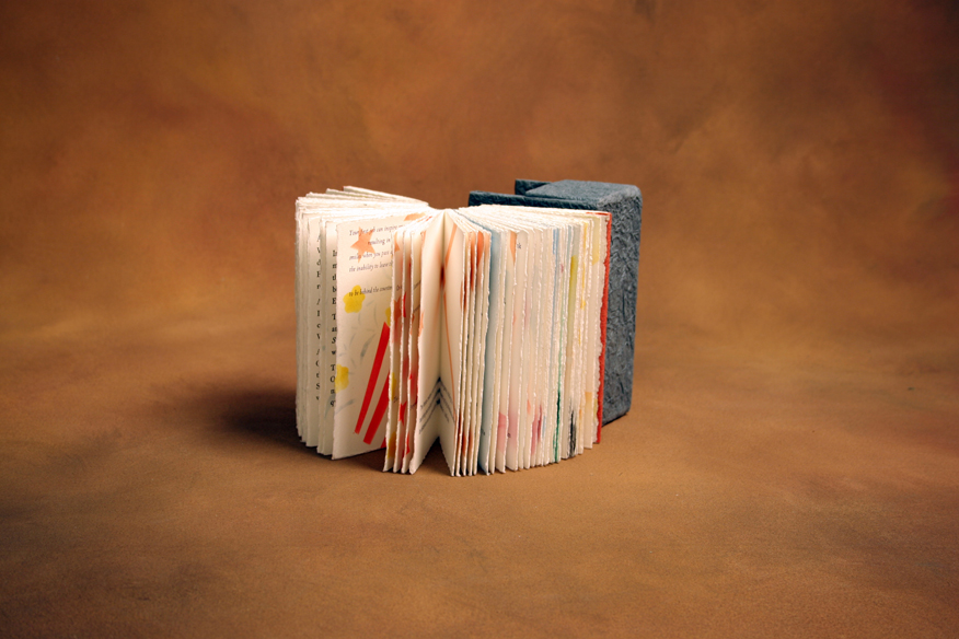
Cut & Dried
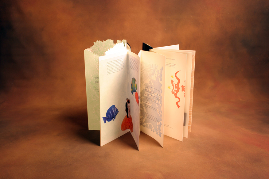
To create Cut & Dried, seven students at Scripps College Press, Claremont, took an extensive but lighthearted look at food from multiple viewpoints while developing technical and creative skills in drawing, photography, woodcutting, writing, typesetting, printing and binding. The first poetic texts were inspired by Wallace Stevens' poem Thirteen Ways of Looking at a Blackbird.
The book was printed on Frankfurt Creme paper with four Vandercook presses. Forum Capitals were used for the headings, and Scripps College Old Style type was used for the front and back material and first poems. Scripps College Old Style Italic type was used for the second poems, and a variety of other delectable fonts were used for the stories. The photographs were printed on an HP Indigo digital printer. The drawings were printed from magnesium relief etchings, and the woodcuts were carved from birch plywood blocks. The case binding features avocado rind-colored cloth on the boards and iridescent green cloth on the spine.
Artist: Collaborative Work
Press: Scripps College Press
Date: 2004
Number and Edition: 44 of 100
Size: 16.75” x 6.75”
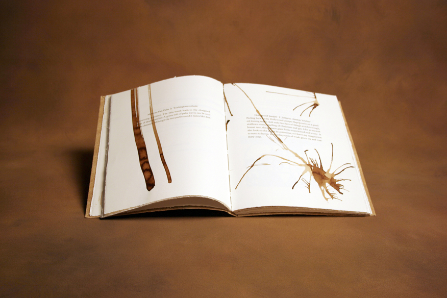
Deep Rooted
The 11 students of the Fall 2001 Typography class at Scripps College, Claremont, went on the Scripps College Tree Tour, a walking adventure that features 24 different species of trees located throughout the historic campus. Professor Kitty Maryatt and the students each selected two species and wrote stories inspired by the trees. The pages were painted with walnut ink, and linoleum prints were created and pressed. The pages were then painted with acrylics.
The type used for the front and back material and the tree descriptions is 14 point Scripps College Old Style. Students chose various typefaces for the interior of their sections. Bark paper was used for the cover and was sewn to the book over bark paper tapes reinforced with Tyvek. Kitty Maryatt, Director of the press used to create Deep Rooted, said: “This is a book not about trees, but of trees.”
Artist: Collaborative Work
Press: Scripps College Press
Date: 2001
Number and Edition: 29 of 75
Size: 7” x 10”
Embedded Meaning
This layered book was created as a class project at Scripps College, Claremont. Before beginning the actual project, each student was required to carve reduction linoleum blocks, print three colored layers, and then develop a short text, (preferably with double or triple meanings) to accompany the layered image. Throughout the semester students defined and redefined their ideas to help release the meaning of the text through words and imagery. They chose to hand-set the type in 14 and 16 point Scripps College Old Style. The 24 point titling was set digitally. The book was printed on Somerset Satin and Rives BFK papers. The binding style is longstitch, and the piece is covered in layered Tyvek and Japanese paper.
Artist: Collaborative Work
Press: Scripps College Press
Date: 2000
Number and Edition: 54 of 65
Size: 14.5” x 8.75”
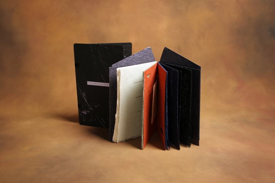
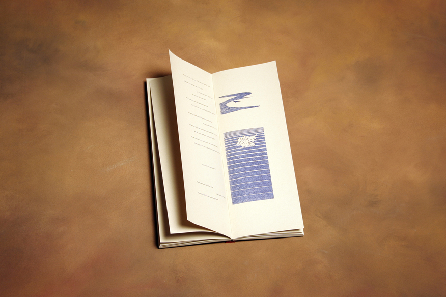
Flight Patterns
Ten stories involving the nature of flight, freedom and risk were created by students at Scripps College, Claremont and combined to create Flight Patterns. The lightweight Japanese mingei paper changes from translucent to opaque black, evoking the metamorphosis of the sky.
Kitty Maryatt, Director of the press used to create Flight Patterns, said: “After lively discussion and analysis of the nature of flight, we observed that flight requires movement, a metamorphosis that involves freedom and risk. The laced paper binding commingles glint and opacity and feels light in the hand, as if you could uncouple the wings and launch it.”
Artist: Collaborative Work
Press: Scripps College Press
Date: 2003
Number and Edition: 41 of 80
Size: 6.75” x 10.75”
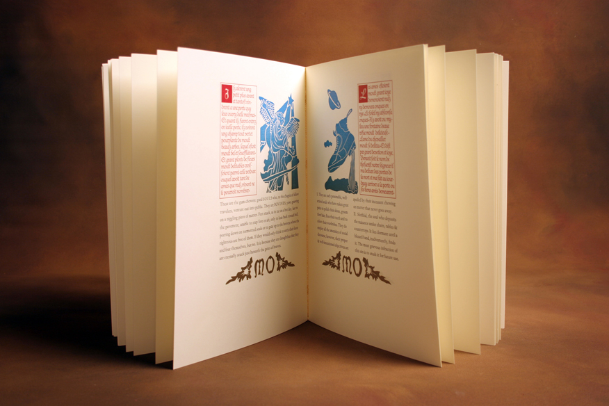
Le Chevalier Tondal
Inspired by a pre-Danten book, “Les Visions du chevalier Tondal,” this Medieval Latin text was reinterpreted and re-imagined for this work. The text, originally written by an Irish monk at Regensberg in 1149 and discovered in a 15th century Burgundian book, details terrible punishments meted out to the wealthy knight, Tondal, for his numerous sins.
The text is letterpress printed on Mohawk Superfine Cover paper and features hand-set type. Maroon wood covers are laced on with gold thongs, sewn with gold thread, and held together with a brass clasp.
Kitty Maryatt, Director of the press used to create Le Chevalier Tondal, said: “This book is an extraordinary effort by students who experienced the sin of over-committing and suffered the torments of too many print runs. But each had a vision and wanted to see it through.”
Artist: Collaborative Work
Press: Scripps College Press
Date: 1999
Number and Edition: 57 of 60
Size: 12.75” x 9.75”
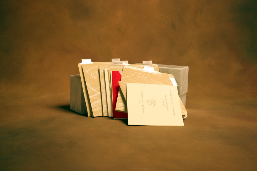
Limited Edition
After reading architect Maya Lin’s book, “Boundaries,” 11 students at Scripps College Press, Claremont, made collective decisions about the methodology of building a book. The text is printed across the gutter, which dictated a glued rather than a sewn binding.
Limited Edition is printed in 12 point Caslon type on Somerset Satin paper. Using a tertiary color system, the method of pochoir was utilized to create the individual imagery. For the unique binding, the spine was glued, then reinforced with Japanese paper. The folios were glued to each other and covers were attached. Next, the covers and spine were wrapped with Japanese paper and glued. Limited Edition is housed in a paper slipcase.
Artist: Collaborative Work
Press: Scripps College Press
Date: 2002
Number and Edition: 47 of 81
Size: 2.875” x 5”
Nous Tissons
Printed letterpress on Arches cover paper, with other papers for inserts, Nous Tissons (“We Weave”) is the 40th book in the Scripps College Press’ student collaborations. It honors both Joseph Jacquard, the 19th century visionary who constructed a loom that used punched cards to control the pattern of threads, and contemporary artist Claire Van Vliet, owner of Janus Press. For this work the students used the thought, “we link our lives with weaving, creating a complex pattern of interwoven paths of both past and present that uses weaving as a metaphor for identity." Paper weavings and linoleum cuts illustrate the book.
Artist: Collaborative Work
Press: Scripps College Press
Date: 2006
Number and Edition: 42 of 102
Size: 7” x 7”
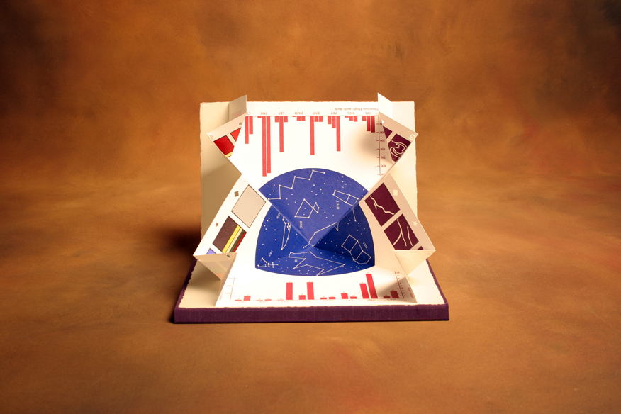
Objects Are Closer Than They Appear: Look Yet Again
This piece, with a dos-a-dos binding, contains stories inspired by a small object of some importance to each student in the typography class at Scripps College Press, Claremont. Tales were woven without stating the object, and the type varies, with most text running across the gutter. The “Objects” side is a pullout of 20 panels, each punctuated by a tiny cutout of various shapes on the bottom. The “Look” side is a poem by Edna St. Vincent Millay and features a two-page pop-up of a star map and graphs.
Measurements of the objects were taken and recorded as bar graphs. Constellations were also created and story paths were recorded. Colors delineating the objects were divided into their percentage of occurrence. All of the information was gathered and configured on a Macintosh computer, and relief plates were made for printing. The color charts were hand-painted with acrylics using Duralar stencils.
Artist: Collaborative Work
Press: Scripps College Press
Date: 2003
Number and Edition: 44 of 84
Size: 11” x 7.5”
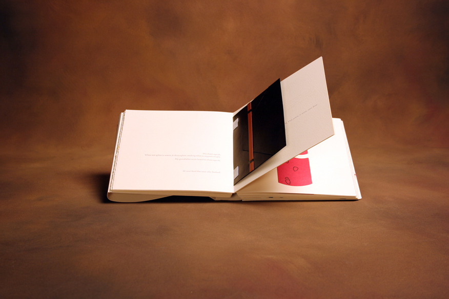
On the Impact of Expectations
To create this unique book, six students at Scripps College Press, Claremont each produced a 5-inch by 5-inch work with individual stories that challenge the reader’s expectations. Different binding techniques were designed to reflect and reveal the structure of each story. Images were created with linoleum blocks, pochoir and photopolymer plates. Rives BFK and Rives Heavyweight papers were used. The front matter typeface is 14 point Scripps College Old Style. The collaborative work is housed in a pearlized acrylic box.
Kitty Maryatt, Director of the press used to create On the Impact of Expectations, said: “I have observed that students often write overly predictable first rough drafts. As a result, the specific focus of this book is unpredictability or surprise. These stories became experiments in challenging the reader’s expectations.”
Artist: Collaborative Work
Press: Scripps College Press
Date: 2001
Number and Edition: 55 of 70
Size: 6” x 6.5”
Square Squared
In 1980, Ulises Carrion wrote a manifesto entitled “The New Art of Making Books.” The students at Scripps College Press, Claremont, investigated what the 21st century finely printed artists’ book might entail. A list of attributes ensued, including the use of space by moving the traditional margins to the edge of the page.
The result of the project was a square-shaped book that carries a square motif through the imagery and text. The works of modern artists such as Piet Mondrian (1872-1944) provided inspiration for the use of colors. The binding is aluminum with brass square cutouts. The paper used is Zerkall Book Laid, and some pages have fabric squares adhered to them.
Artist: Collaborative Work
Press: Scripps College Press
Date: 2003
Number and Edition: 35 of 90
Size: 7.25” x 7.25"
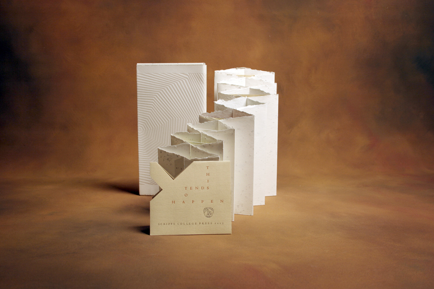
This Tends to Happen
Printed on Frankfurt Cream, Frankfurt White, Nideggen, and multi-colored Thai papers in 12 point Centaur type, this hand-sewn double accordion fold binding contains carved linoleum blocks and magnesium relief engravings for illustrations.
Kitty Maryatt, Director of the press used to create This Tends to Happen, said: "Scripps First Year students are required to read William Gibson's science fiction novel "Pattern Recognition" as a preparation to discuss postmodernism. Gibson asserts that everything is pattern recognition. In this vein, students in the Typography and the Book Arts class decided how they would define patterns. They wrote texts with the idea of presenting text as image, inspired by Iliazd [the Dadaist writer], and image as readable text. In the process, they gave meaning to their pattern making.”
Artist: Collaborative Work
Press: Scripps College Press
Date: 2005
Number and Edition: 36 of 99
Size: 5.5” x 10.75”
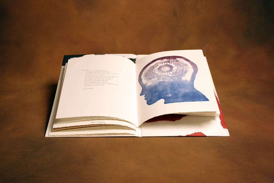
Unbuttoned
The materials used to create Unbuttoned include notions and novelties such as brads, buttons, fabric, ribbon and thread. The piece is bound with Museum board attached to endpapers and was printed on Mohawk Superfine 80 pound cover stock paper. It was letterpress printed and contains pop-ups and a “volvelle,” or lunar clock. Images carved from linoleum, some printed with rainbow rolls, and four-color images printed on an HP Indigo digital printer provide the illustrations.
Kitty Maryatt, Director of the press used to create Unbuttoned, said: “Each semester a diverse group of students arrives at the Scripps College Press and works toward a common goal of creating a cohesive artists' book. This semester we played with a novel approach: various physical and emotional attributes of a major character were suggested by the group. As individual stories were written about her, with no pre-conceived sequence, our character’s personality became clearer and evolved further.”
Artist: Collaborative Work
Press: Scripps College Press
Date: 2005
Number and Edition: 41 of 102
Size: 6.25” x 12.5”
Contact Us
Cerritos Library
18025 Bloomfield Avenue
Cerritos, CA 90703, United States
(562) 916-1350
Contact Form